One Americana brand isn’t getting the barrel-of-monkeys response they were hoping for when launching their new logo this week.
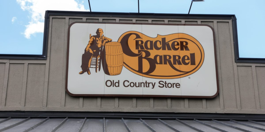
Cracker Barrel—one of the most iconic restaurant chains in America, deeply rooted in Southern food and hospitality—this week revealed a new look.
A tweak to the logo removes the man sitting on a chair and leaning on a barrel, and the font appears to have slightly changed.
And some people are absolutely outraged, with many going as far to say its new, simplified logo is a signal of Cracker Barrel going woke.
“This isn’t modernization. It’s extermination of Americana, of warmth, of memory,” she continued. “Congratulations, Cracker Barrel. You’re now Woke Barrel. Nobody asked for this.”
Cracker Barrel lost nearly $100 million in value in trading on Thursday. The stock slightly rebounded Friday, up about 0.25% in the late afternoon.
Cracker Barrel didn’t immediately respond to Fortune’s request for comment.
“This could potentially offend the restaurant’s core fans, who see the chain’s rocking chairs, comfort food and nostalgia as the elements that make Cracker Barrel feel like that home away from home,” said Delano, who’s helped bring iconic brands like Pink Whitney to market.
“Cracker Barrel is nostalgia for many, especially customers in the South and Midwest who feel ownership and pride over the brand,” Williams told Fortune. “For a brand that hasn’t changed its logo since 1977, even small changes to a symbol so tied to Americana can feel magnified.”
Nierman argued, however, Cracker Barrel’s new logo doesn’t erase its legacy. Rather it softens its image.
“Cracker Barrel has long leaned into a version of Americana that felt frozen in time,” he said. “This update suggests the brand is finally acknowledging that the world around it is changing, and it wants to be part of that future.”


